

In today’s fast-paced digital world, most users access information on their smartphones and tablets, making mobile devices the dominant platform for data exploration. As a result, the way we approach data visualization has evolved significantly. Presenting data in a clear, concise, and visually appealing manner on smaller screens is both an art and a science. Mastering data visualization UI design for mobile is crucial for conveying insights quickly to diverse audiences.
The challenge lies in distilling complex datasets into easily understandable charts, without overwhelming or alienating users. Poorly executed chart designs on mobile can mislead viewers, hinder data-driven decisions, and dampen engagement. In contrast, thoughtful mobile chart design not only improves comprehension but also enhances the user experience, driving higher retention and more informed action.
Importance of Mobile-Friendly Charts
More than 50% of global internet traffic now comes from mobile devices, according to Statista. This staggering statistic underscores the importance of mobile optimization for digital content. Charts and graphs that work flawlessly on desktops may falter on mobile, creating confusion or obstructing access to vital information. By focusing on mobile-friendly chart design, organizations ensure their data communicates clearly and inclusively across devices.
Poor mobile data visualization can result in user frustration, higher bounce rates, and even misinterpretations that lead to costly errors. Designers who prioritize user experience and accessibility help users navigate information with confidence, reinforcing brand trust and boosting engagement. This emphasis on thoughtful mobile design is becoming a best practice across industries as more consumers demand immediate, on-the-go insights.
Key Principles of Mobile Chart Design
Successful mobile chart design is grounded in several key principles that address the specific limitations and opportunities of smaller screens:
- Simplicity: Eliminate unnecessary elements and highlight the most essential data points to reduce clutter.
- Readability: Opt for clear, legible fonts and strong color contrasts to ensure all data is distinguishable, even in bright lighting conditions.
- Responsiveness: Charts should fluidly adapt to varying screen sizes and orientations, while maintaining their integrity.
- Interactivity: Enhance engagement with intuitive, mobile-optimized controls that let users explore data by touch.
Following these guidelines not only improves usability but also ensures that data remains comprehensible and actionable in mobile environments.
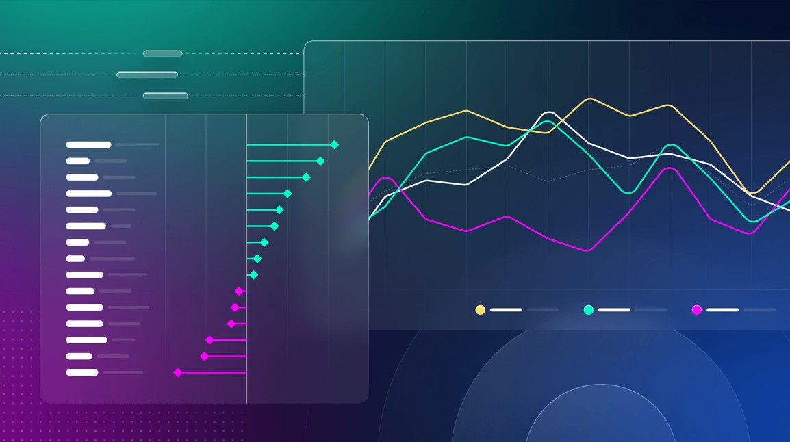
Effective Chart Types for Mobile
Given limited screen space, not every chart format is suitable for mobile presentation. Research by Boundev and other UX experts suggests that certain chart types are far more effective:
- Horizontal Bar Charts: These allow for easy reading of labels, which are positioned to the left and can be scrolled through if the list is long.
- Sparklines: These miniature line graphs are perfect for delivering quick trend snapshots adjacent to critical metrics.
- Line Charts (1-2 series): Compact line charts can communicate patterns efficiently when enhanced with tap-to-reveal tooltips instead of traditional hover actions.
Conversely, scatter plots and bubble charts prove ineffective on mobile, as small data points are often challenging to interact with using fingers.
Touch-First Interaction Design
Designing for touch interaction is essential, as mobile users rely exclusively on their fingers to navigate. The absence of a mouse means that standard desktop design conventions must be reimagined. Key considerations for touch-first design include:
- Replacing Hover with Tap: Tapping an element (such as a bar or point) should surface explanatory tooltips or additional data, as hover effects are not available on mobile.
- Using Swipe for Navigation: Swiping can let users move between data sets, time periods, or comparison groups, making it easy to explore without excess on-screen controls.
- Placing Controls in the Thumb Zone: Interactive buttons and selectors should be positioned where the thumb naturally rests, typically at the bottom half of the screen, for ergonomic access.
These touch-specific patterns create a smoother, more comfortable experience, encouraging deeper interaction with the data presented.
Accessibility in Mobile Data Visualization
Inclusivity should be a core focus in mobile data visualization. Making charts and graphs usable for all, including people with visual, cognitive, or motor impairments, is both an ethical responsibility and a legal requirement in many jurisdictions. Tools like Umwelt demonstrate how combining visualizations with descriptive text and sonification can make complex datasets accessible to blind and low-vision audiences. Embedding these features ensures everyone can benefit from data-driven insights and is increasingly prioritized by leaders in digital product design, as highlighted in articles on Nielsen Norman Group.
Challenges and Solutions
Presenting data effectively on a small screen poses unique challenges, including limited space, varying device performance, and inconsistent network speeds. However, a range of solutions enables designers to overcome these hurdles:
- Prioritizing Information: Emphasize the most relevant metrics and allow less important data to be accessed with additional user input.
- Progressive Disclosure: Present summaries up front. Let users tap to view more granular details or additional layers of information as needed.
- Adaptive Design: Employ responsive and adaptive layout techniques so visualizations render correctly across all devices and orientations, from smartphones to tablets.
By focusing on these strategies, designers can build charts that are visually engaging and truly functional for every user.
Conclusion
As mobile device usage continues to skyrocket, prioritizing effective chart design for these platforms is essential. By following principles of simplicity, clarity, adaptability, and accessibility, designers ensure users can interpret and act on data in any context. The future of data visualization is mobile, and embracing these best practices will help organizations remain relevant, trusted, and user-focused in an increasingly digital world.